


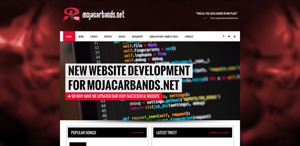
Upgrades to the mojacarbands.net website
As some of you are already aware, we have over the last few months we have been working on a new fantastic website for you! We have been working on the design of a dynamic site. We wanted the site to be fully database driven to allow searches by band, venue, date, location and fully integrated with Google Maps.
The new website is fully compatible with mobile devices as 62.5% of our users view the site through saved Facebook URL links on their mobile device*. To date, we have had 106,858 visitors to our existing site, which means approximately sixty seven thousand people used a mobile platform to view mojacarbands.net via Facebook links. The overall mobile usage of our site is 87.8%.
A mobile friendly website is essentially when your regular website shrinks down to be small enough to display on a mobile device. It looks like a tiny version of your website, however there can be a lot of zooming, pinching and scrolling going on, together with the site displays and functions not quite working the same as a viewing on a desktop. It can lead to a less than ideal user experience, some companies put up with it as they say at least their site is viewable on a mobile platform.
We didn´t want this for our users, we wanted mojacarbands.net to be a fully responsive website. Our design is fully optimized to work good on multiple devices, browsers, and systems. In fact, our website design incorporates the design to be fully responsive to each mobile device. So it does not matter which mobile device you use our new responsive website will change the site to suit the device you are using, to always give you the best view of our site. This is why we moved to a fully responsive theme as a large proportion of our website visitors are visiting our website using a mobile device, as they listening to the music provided in Mojacar and the surrounding areas. The site is best viewed turning your phone on it’s side.
For people who want more technical information…
We wanted a fast loading speed, the loading speed of a website is also influenced by the content management system you use to create it, we opted to use WordPress which is already optimized for good speed.
We wanted a good coding standard, WordPress is one of the most advanced systems currently on the market it was launched on the 27th May 2003 and new versions are introduced every few months, expert developers are there to take care of the platform. Our system incorporates XML Sitemap which easily generates and submits sitemap to search engines, it helps them recognize the structure of our site content.
In WordPress navigation becomes very robust with menus, drop down menu functionality, tags, categories, and tons of widgets provided through WordPress. Image optimization, adding title & alt tags in images takes no time, So we can optimise our images for good ranking of our posts or pages.
We wanted to incorporate social media integration as search engines give importance to sites getting good traffic from social networking sites. WordPress fully supports social media integration. We have included our Twitter, Facebook and YouTube connections.
The most important feature we wanted to improve was the end user experience. Our WordPress system is fully optimized to work good on multiple devices, browsers, and systems. In fact our website design incorporates the design to be fully responsive. A responsive design website is built using flexibly sized elements, controlled by style sheets, javascript and HTML. No matter what size screen the user is viewing with, the text, images, navigation and graphics will size fluidly. It’s not device-specific or browser-specific. It’s designed to look good and function well at any size. You can see how a responsive site will look on a mobile device by looking at it on your desktop/laptop and just shrinking and expanding your browser window. You’ll see three columns shift to two, and then one. You’ll see pictures and graphics shrink and navigation adjust.
Responsive themes follow the responsive web design approach which aims to create websites that offer optimal user experience across various devices and screen resolutions including desktop computers, tablets such as iPad, smartphones and other mobile devices. A responsive WordPress theme smoothly adjusts its layout based on the screen size and resolution. Responsive designs offer better readability and usability on smaller screens such as smart phones. It also prevents you from creating a device specific mobile version. Before responsive themes, sites would have to create a different mobile version for each platform such as iPhone, Android, etc. Responsive design allows a single site to be viewed on various devices without the need for additional themes or plugins. A growing number of people are accessing internet through tablets and smartphones.
Mojacarbands.net
* Data taken from 21st January 2017.